Using Outlet and Light Switch Icons in Your Workplace
In busy workplaces—especially shared offices, nonprofits, schools, and clinics—it’s common for lighting panels to include three, four, or even five unlabeled switches. The result? People guess, flip everything on or off, or worse—leave unnecessary lights running all day. Using outlet and light switch icons can virtually eliminate this problem.
That’s where outlet and light switch icons come in. Clear visual labels help your team navigate lighting zones without confusion, reduce energy waste, and support a safer, more efficient workplace.
This guide shows you exactly where and how to use light switch icons throughout your organization.
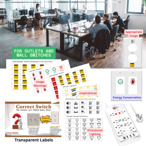
🧭 Area-by-Area Guide to Labeling Light Switches in Shared Workspaces
1. Conference Rooms – (Outlet and Light Switch Icons – Priority)
Common Fixtures:
- Recessed ceiling lights
- Pendant or decorative lights
- AV/projector lighting
- Wall sconces
Recommended Icons:
- Recessed light icon
- Hanging light or pendant icon
- Spotlights
- Wall light icon
Why it matters:
Conference rooms often have multiple switches and inconsistent lighting use. Icons help staff set the right mood for meetings and prevent unnecessary power use after hours.
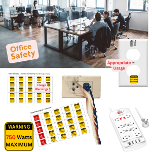
2. Shared Offices & Desk Zones – (Outlet and Light Switch Icons – Priority)
Common Fixtures:
- Individual overhead or desk lights
- Zone lighting for hybrid hot-desking areas
- Power-conservation zones
Recommended Icons:
- Desk light icon
- Ceiling light
- Reminder labels: “Turn Off,” “Business Use Only”
Why it matters:
Hybrid work environments thrive on clarity. Light switch icons ensure users know what they can control—without disrupting coworkers or systems.
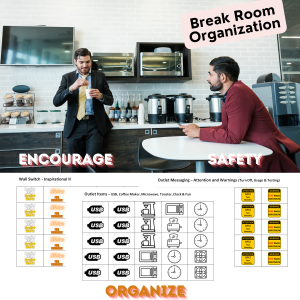
3. Breakrooms and Kitchens – (Outlet and Light Switch Icons – Priority)
Common Fixtures:
- Under-cabinet lights
- Overhead or ceiling lights
- Specialty task lights
Recommended Icons:
- Cabinet lighting icon
- Kitchen light or generic light icon
- Reminder: “Turn Off When Not In Use”
Why it matters:
Unlabeled switches in break areas can lead to lights left on all night. Icons paired with reminders support workplace energy-saving policies.
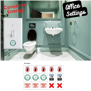
4. Restrooms – (Light Switch Icons – Priority)
Common Fixtures:
- Main light
- Bathroom fan
- Night light or accent lighting
Recommended Icons:
- Fan icon
- Lightbulb
- Sconce or mirror light
Why it matters:
Distinguishing the fan from the light can reduce noise complaints, promote proper ventilation, and support cleaning crews.
5. AV Rooms & Tech Closets
Common Fixtures:
- Spotlight
- Rack lighting
- Motion sensor overrides
Recommended Icons:
- AV spotlights
- Tech cabinet lights
- Projector icon
- “Do Not Turn Off” label
Why it matters:
One wrong switch can interrupt presentations or kill a livestream. Icons make sure staff know what to avoid and what’s safe to operate.
6. Hallways and Stairwells
Common Fixtures:
- Directional lighting (front, back, left, right)
- Motion-activated systems
- Emergency floodlights
Recommended Icons:
- Directional arrows
- General light icons
- Motion sensor override icon
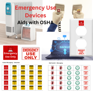
- Safety icon + “Emergency Use Only” label
Why it matters:
Directional labels reduce confusion, especially in large buildings. They also help cleaning or facilities staff avoid turning off critical safety lights.
7. Outdoor and Security Lighting
Common Fixtures:
- Motion-activated floodlights
- Entryway lights
- Sign or parking lot lights
Recommended Icons:
- Security light
- Motion sensor light
- Outdoor flood icon
- “Do Not Unplug” or “Critical Device” label
Why it matters:
Outdoor lighting is often forgotten. Icons reinforce the importance of these switches and help avoid security lapses.
✅ Combine Icons with Reminders for Maximum Clarity
Use Correct Switch – At Work labels that combine icons with messages like:
- “Notice: Turn Off When Not In Use”
- “Emergency Use Only”
- “Business Use Only”
- “Do Not Touch”
This reinforces behavior while still providing quick visual guidance.
🧠 Who Benefits from Light Switch Icons?
- Employees: No guessing, flipping, or backtracking
- Visitors & Clients: Navigate unfamiliar spaces with ease
- IT & Maintenance Staff: Avoid unintentional outages
- Office Admins & Safety Leads: Standardize control panels and reduce energy waste
🛠 Tips for Implementing Workplace Labeling
- Label every multi-switch panel (3+ switches = 3 guesses without labels)
- Use icons that clearly match the lighting type or room function
- Combine icon + text for high-traffic or compliance-sensitive areas
- Conduct a quick “switch audit” and label over a weekend or slow day
📎 Related Articles in This Series:
- What Are Light Switch Icons? (And How They Improve Workplace Clarity and Safety)
- Switch Icons vs. Text Labels – Which One Works Best for Offices and Teams?
- Energy Conservation Tips for Work – Simple Habits That Save Money and Improve Safety
🔍 FAQ (Schema-Ready)
Q1: Where should light switch icons be used in the workplace?
Anywhere with multiple switches, shared lighting zones, or confusion about lighting control—especially in shared, safety-sensitive, or energy-critical spaces.
Q2: How do switch icons help with energy conservation?
They clarify what controls what, making it easier for staff to turn off only what’s necessary and avoid leaving lights on unnecessarily.
Q3: What’s the difference between icon-only and icon + text labels?
Icon-only works great for quick recognition and multilingual teams. Icon + text adds precision for high-stakes or compliance-focused environments.